Case study 2
A new generation of Sonos speaker controls
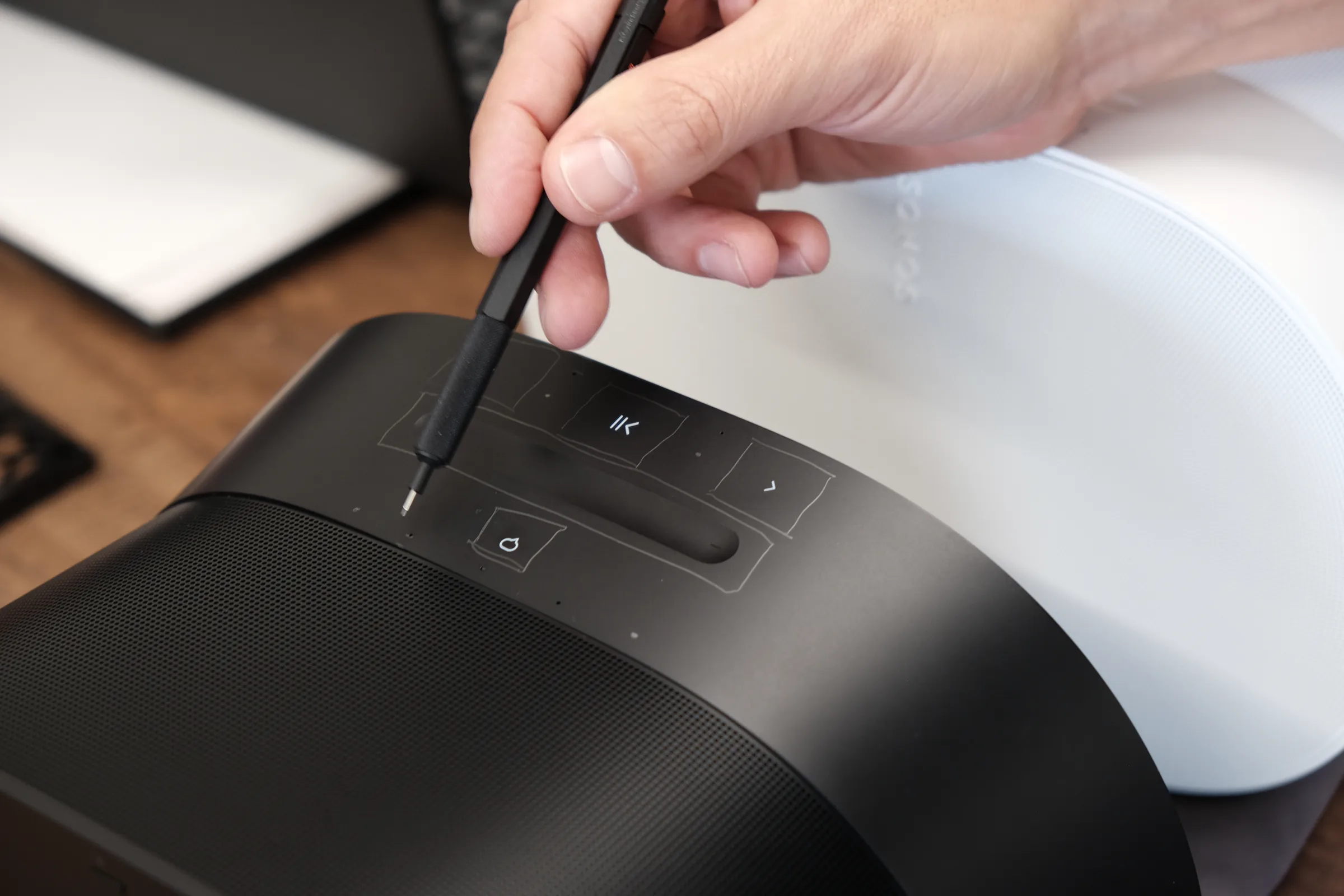
Era 300: mapping capacitive-touch areas on the control surface.
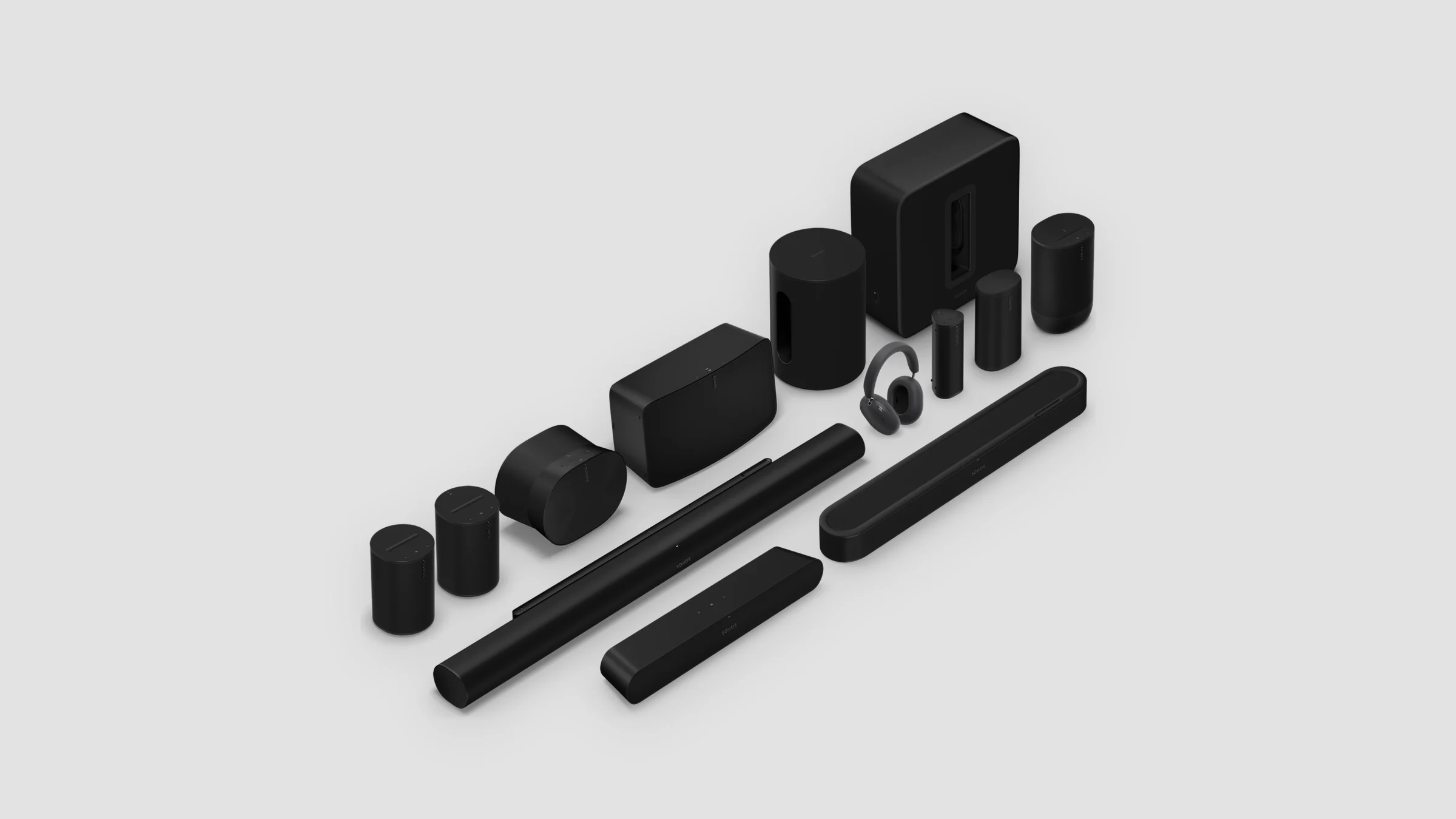
Sonos hardware controls evolve as generations. Each new generation makes the controls easier to use and supports new capabilities coming to the system. My team designed and delivered Lean UI, the hardware controls on Sonos’s current home portfolio: all-in-one speakers, home theater soundbars, and the largest portable speaker. It shipped first on Era 100 and Era 300 in March 2023, then on Move 2 and Arc Ultra.
My role
Led the hardware UX team that designed Lean UI, as Director and then Senior Director of UX.
Team
Designers on my team owned the mic UI and the Era 100 and Era 300 controls, including the volume trough.
Partners
Industrial design, electrical engineering, CMF, antenna, user research, and others.
What I did
Set direction, reviewed the work, worked across the other discipline leads, and shaped what the research studies examined.
Context
Generations of Sonos hardware controls
The first Sonos speakers used mechanical buttons: physical play/pause and volume, plus a Join button used mainly once, during setup. Then came capacitive touch.
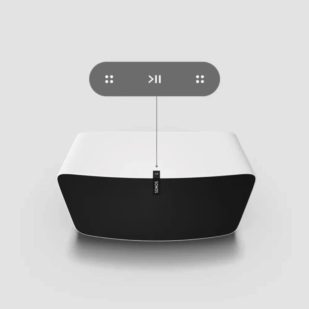 Signature detail · 2015
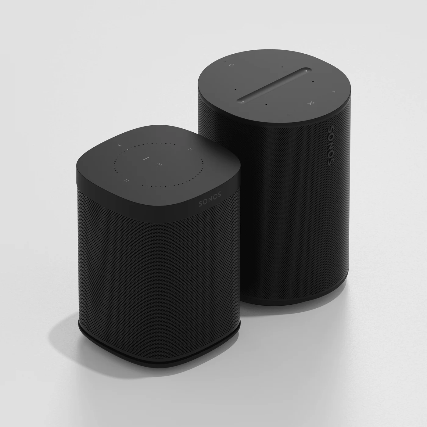
Introduced with Play:5 (gen 2). Capacitive touch on the primary control surface, with the vertical logo on the front grille leading up to play/pause.
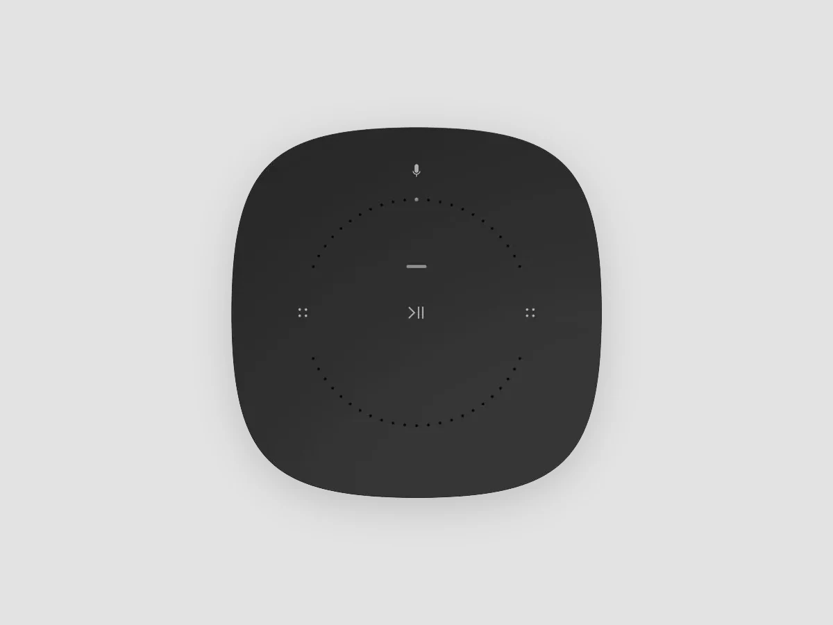 Signature detail, with voice
Extended to Sonos One and Beam, which added the first mic control: a single toggle on the top surface.
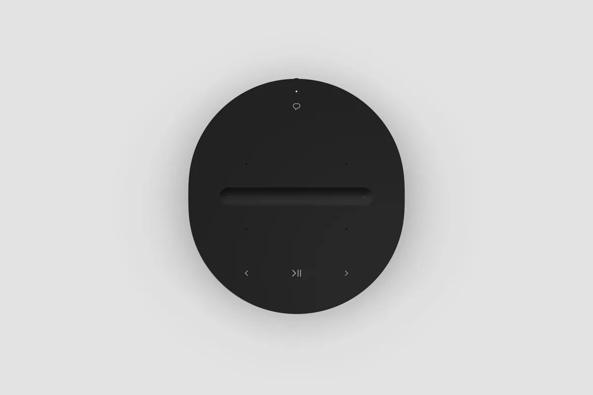 Lean UI · 2023
Introduced with Era 100 and Era 300, with a two-part mic control: a switch on the back and an assistant toggle on top.
Three things pushed the next generation.
The controls needed to be more obvious.
Signature Detail used four-dot volume icons and a swipe gesture for skip. Research showed that some controls were not obvious without prior familiarity with Sonos, a finding later reinforced by field behavior. Lean UI moved to explicit volume and previous/next icons, with more generous touch targets for reliable, low-attention control.
One mic button did too much.
It turned voice, Auto Trueplay, and Swap on or off together. Customers were more comfortable with mics used for sound tuning than for voice assistants. A dedicated mechanical switch gave customers a clear way to physically disable microphones, separate from the control for voice assistants.
Bluetooth was coming to the core portfolio.
It needed a place in the control hierarchy.
Every change also had to make sense next to older generations in the same home. Sonos supports its hardware for years, and customers build their systems over time.
Approach
Volume got the most physical gesture
Volume is the most-used control. We tested shapes and surface geometry with customers: orientation, depth, ramp. The trough tested best. People understood it, used it easily, and got to the volume they wanted. It also works on every form in the home portfolio, from a speaker to a soundbar.
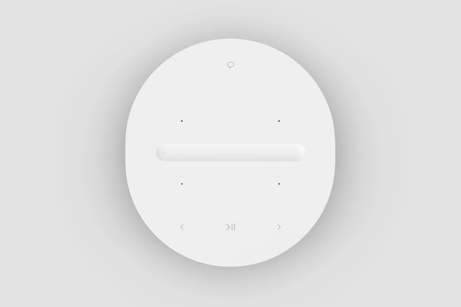

The primary controls became explicit
Familiar +/– icons made volume direction clear, and previous and next became visible controls instead of gestures. Play/pause kept its central position but gained a larger touch target, making the controls easier to understand and more reliable to use with low attention.
Bluetooth came to the core portfolio, and the Join button went away
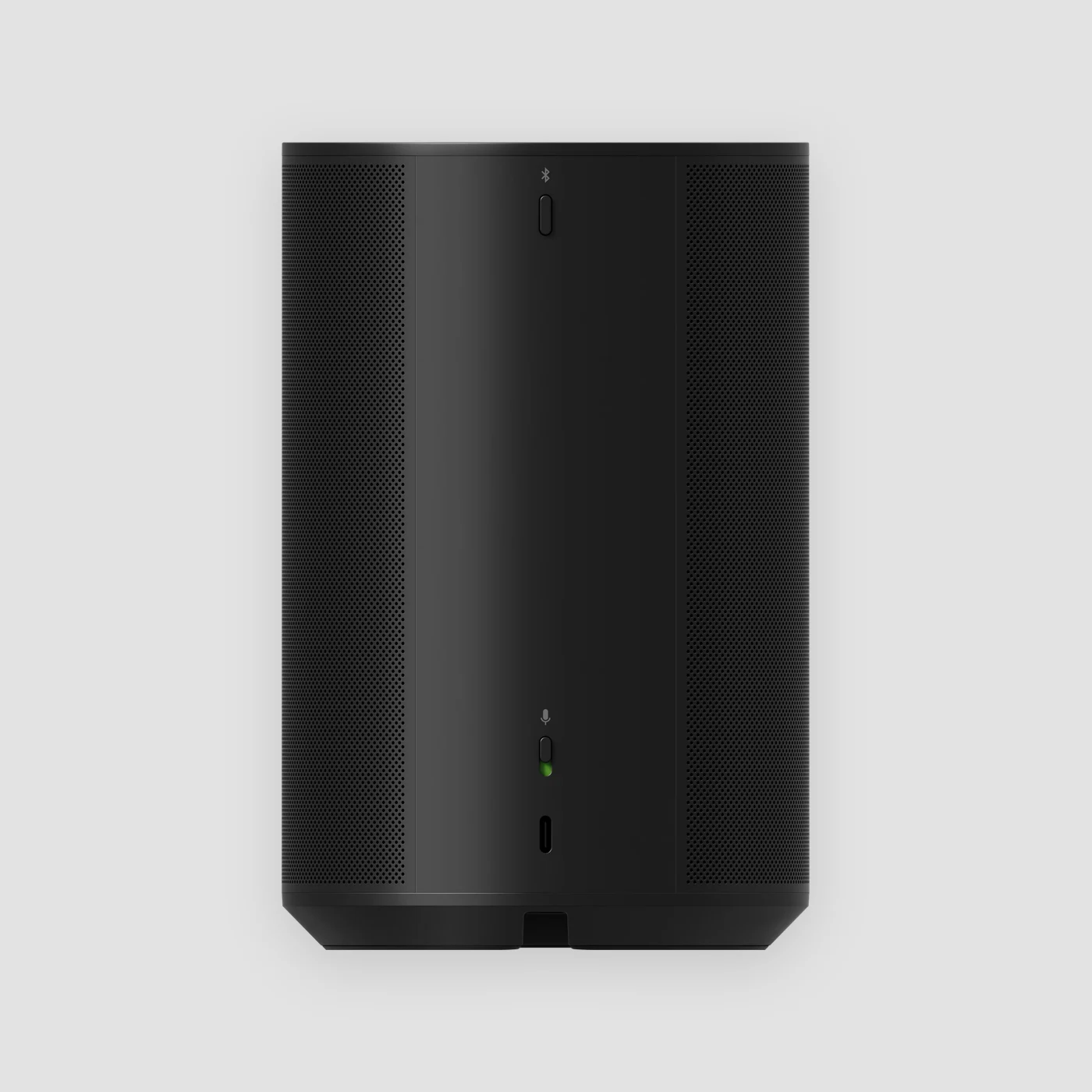
Bluetooth was coming to products that had never had it in the Sonos portfolio, including the all-in-one speakers and home theater soundbars. It needed a natural place in the control hierarchy. Pairing is occasional, so the Bluetooth button went on the back, with the other controls people use less often.
That also settled the Join button. BLE had already made setup hands-off, so its main job was gone. Its remaining jobs, guided resets and diagnostics, moved to the Bluetooth button.
The status light faces the room
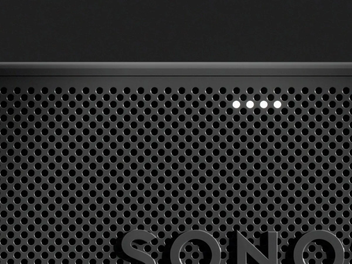
The status light gives feedback during interactions like voice, so people have to see it from wherever they are. The first-generation Beam had a top-facing status light; later products placed it on the front to make it easier to see from across the room.
A change like this has to travel across a portfolio. Era 100, Era 300, Move 2, and Arc Ultra all have a front-facing light, and Beam Ultra now does too.
Mic control split in two
We designed separate controls for microphones and voice assistants. A mechanical switch on the back physically disabled all microphones. With that switch on, a separate control let customers turn voice assistants on or off while keeping microphone-powered features such as Auto Trueplay and Swap available. Customers could disable voice assistants without losing those features, or switch off all microphones when they wanted.
Back · set once
Mic switch
Mechanical. Turns off every microphone. Green = available.
Top · used often
Assistant toggle
Mutes voice assistants only. Sound tuning and Swap keep working.
How they combine · the switch always wins
Switch on
Toggle on
Voice on
The assistant listens for its wake word. Sound tuning and Swap work.
Switch on
Toggle off
Voice off
The assistant is muted. Sound tuning and Swap still work.
Switch off
Toggle disabled
Everything off
No voice, sound tuning or Swap. Switch back on: the assistant returns to where you left it.
Outcome
One control model across the portfolio
Lean UI is the control system on Era 100 and Era 300 (March 2023), Move 2 (September 2023), and Arc Ultra (October 2024). The two-part mic control also shipped on Sonos Play.
Customers got a new generation of controls that is easier to use, and it works alongside the products already in their homes. The mic icon kept its meaning, the model is the same on every product that uses it, and an older speaker and a new one still read as one system.